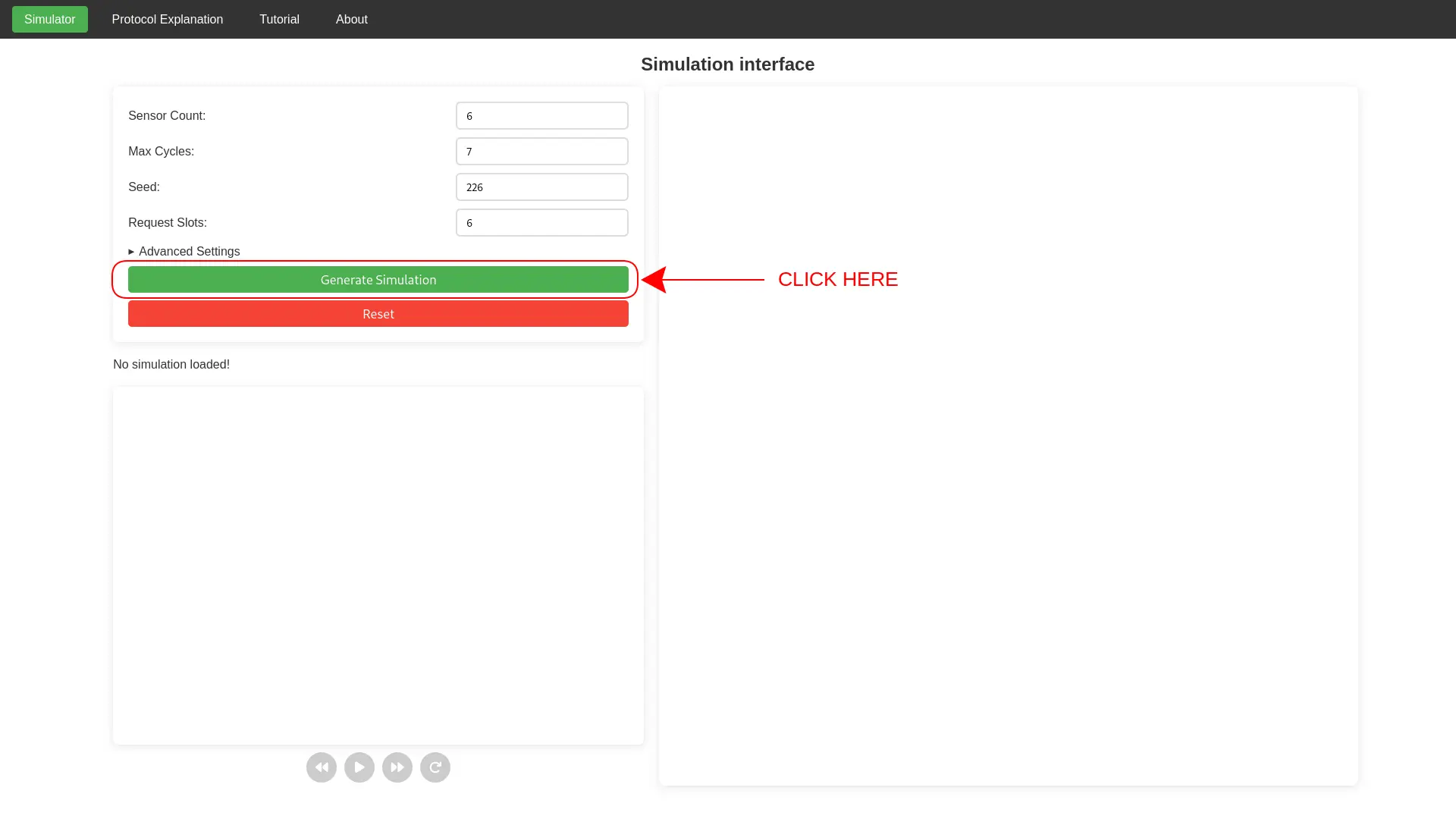
How to use the simulator
In order to generate the simulation, press on the
Generate Simulation button.
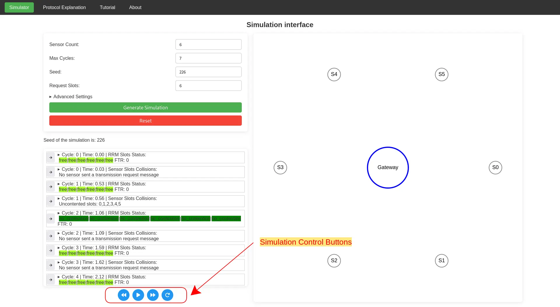
Additionally by scrolling down, graphs and stats about the
simulation can be seen. Now try changing the parameters of the
simulation and see how the visualization and stats changes!
Parameter Explanation
- Sensor Count: How many sensors will be simulated
- Max Cycles: How many cycles will be simulated
- Seed: Set to have consistent simulations, otherwise leave blank for full randomness
- Request Slots: How many slots for transmitting data are available in a single cycle
- Data Channels: How many radio channels available for the sensor data transmissions. More data channels means that more sensors can transmit data at the same time on multiple channels, potentially shortening cycle period time
- Sensor Measurement Chance: Chance that the sensor, when in idle state, senses a real phenomena and wakes up to send data (ranges from 0.0 to 1.0 meaning 0% to 100%)
- Sensor Data Payload Size: Size of the payload, in bytes, that the sensor sends to the gateway. A bigger payload size may lenghten the cycle period time
Stats Explanation
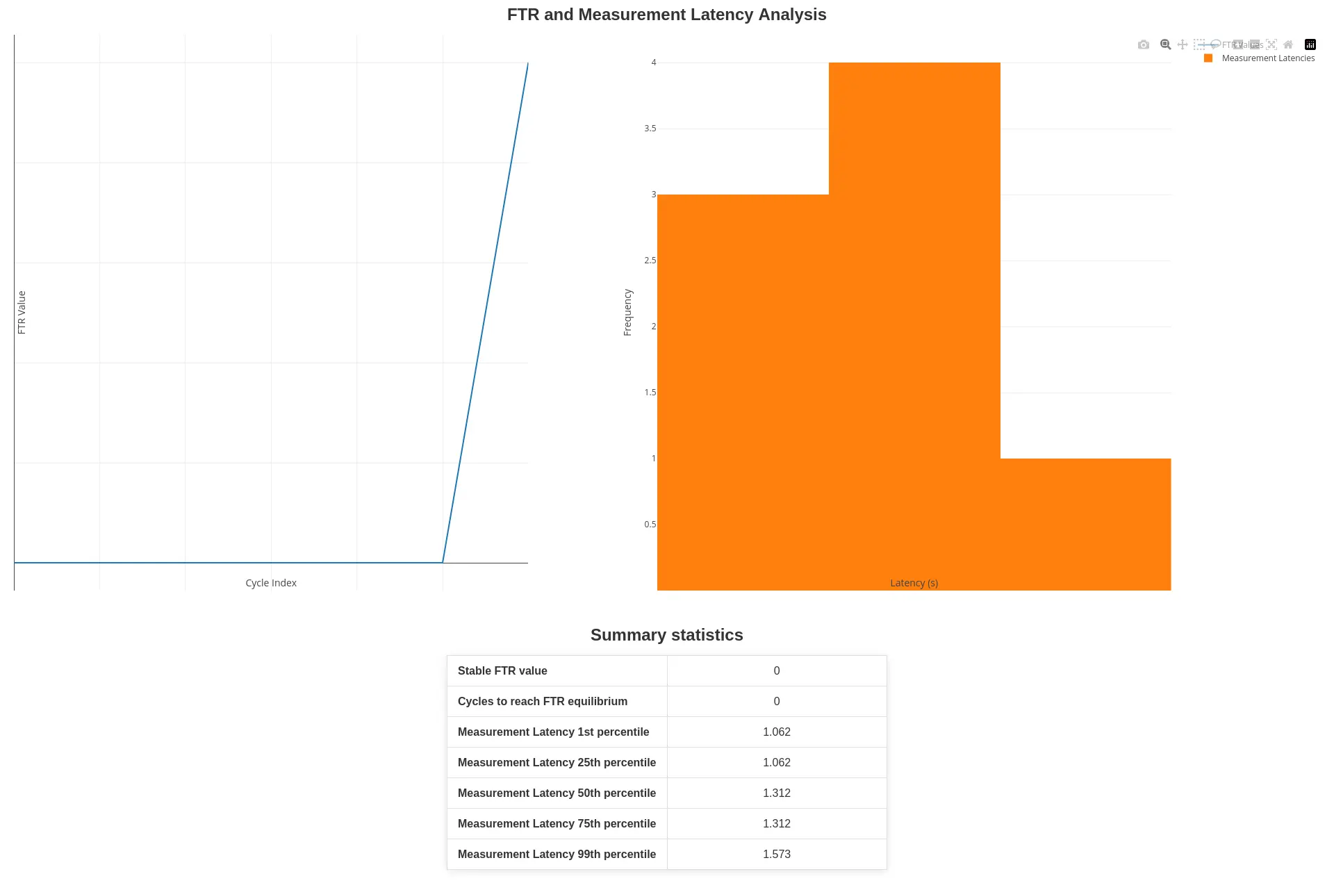
FTR Line Chart
The FTR value represents the current number of sensors that are backed off. A high FTR value means that there is high network congestion and many sensors are currently awaiting their turn. A low FTR value means that a small number of sensor is awaiting their turn and the network is not busy. From the line chart, it can be seen how the FTR evolves as time goes on.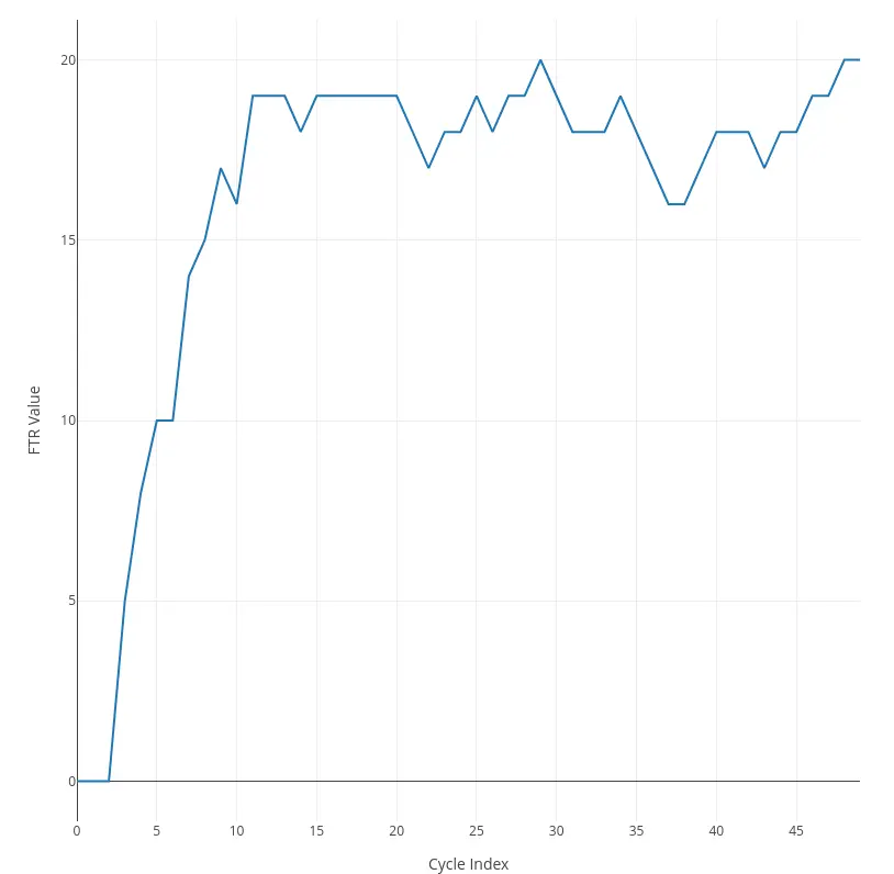
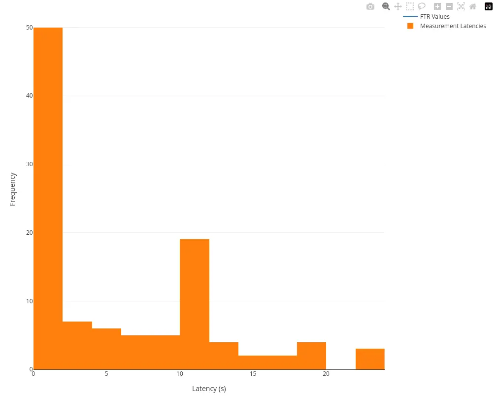
Measurement Latency Distribution
The histogram on the right instead represents the distribution of data transmission latencies. The latency in this case is referred as the difference in time between when the data transmission has been received by the gateway and by when the data was first sensed.